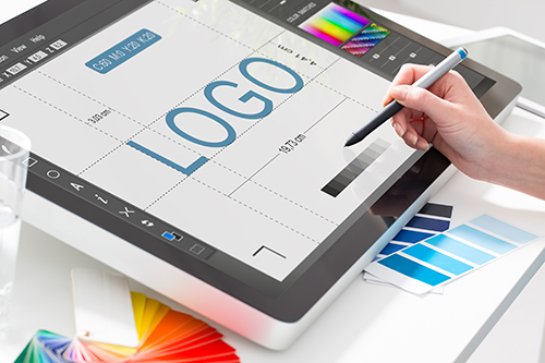
How to Create Your Next Real Estate Logo
Your logo is an important part of your overall real estate brand. The logo is often the first thing a potential client will see, so yours should be unique, professional, and relevant.
Designing the perfect real estate logo can take time but it is possible to create a memorable logo on your own. You could also hire a graphic designer to do the work, and affordable designers can be found on freelance sites like 99designs.com.
Whether you’d like to outsource logo design or feel comfortable making your own, keep the following five considerations and best practices in mind. They’re equally helpful when DIY-ing logo design or while reviewing what a designer has created.
1. Steer clear of clichés
How many real estate logos have you seen with the same design elements, like rooftops and outlines of a house? If you want your logo to be more memorable, stay far away from these overused design elements. For more insight into some of the most common real estate logos, do a quick online search for ‘real estate logos.’ You’ll see some creative examples, but you’ll also quickly see what not to do.
2. Incorporate a sense of place
You may be thinking, “Okay great, I know what types of imagery to stay away from. But what images can I use in my logo?”
To answer this question, think about some of the things that make your city or region unique. Is there a quirky local culture or a prominent landmark? A generic house image doesn’t demonstrate sense of place, but local elements add a unique touch to your logo.
You could also use other house-related images. Keys, locks, welcome mats, trees, picket fences, yards, and more can all evoke a feeling of home.
3. Choose the right font
Some real estate logos are all about the typography. You could display your initials or the business name in a strong font, for example. The key is to select a bold font that shows competency and respectability, not something that looks childish and unprofessional.
4. Experiment with colors
Like fonts, colors are an important part of any logo design. You don’t want a logo that looks like a bowl of Fruity Pebbles, but you do want eye-catching colors that stand out. Fortunately, there are a number of free tools that make color selection for logos easier, like this online generator.
5. When in doubt, keep it simple
A cluttered and chaotic logo won’t be an effective tool for your real estate business. You need something that clearly communicates your brand’s personality and mission, without going overboard.
To make sure your logo is compelling without being overwhelming, share the designs with friends, family, and colleagues. This is a great way to crowdsource feedback before committing to a final design, especially if anyone in your network has a keen eye for design.
2-10 HBW offers comprehensive Systems and Appliances Home Warranties to help protect your clients from unexpected repair and replacement costs. Contact us to learn more.


